Have you been managing your Apple Search Ads campaign for a while? If you have, I imagine that you’re pretty happy with how you’re optimising bids and allocating budget, whether you’re doing this manually or programmatically. You are probably well-versed in the calculations involved in determining the conversion rates between the tap and the completion of your KPI event and in the adjustments you should be making for the well-known common discrepancies between Apple and your attribution provider.
Working through these calculations is vital for a cost-effective campaign but they’re not ‘the be all and end all’ of Apple Search Ads success. Relevant keywords and competitive bids can get you Impressions but the advert itself needs to be engaging enough to entice the searcher to interact with your app’s listing. You may feel that you have little control over the look of the advert - especially, in contrast to traditional Pay Per Click (PPC) advertising - but that’s simply not true. To create the advert, Apple takes elements of your app’s Product Page and pieces these features together to form the advert you see at the top of the search results in the iOS App Store. So, if you want a good-looking advert, you’ll need a good-looking Product Page.
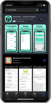
The first asset to review should be the one that is the most visible and for the Apple Search Ads advert, it’s usually the screenshots. And, with the iOS 13 update, the screenshots now take up even more space in the advert (see left). The screenshots give you the opportunity to persuade the searcher to engage with your app instead of the app they may have originally been searching for. Each image should visually communicate the app’s user experience and highlight a ‘best feature’ of the app.
Screenshots can be uploaded in either portrait or landscape orientations and you should test which orientation delivers the best conversion rate for your app. Equally, you will need to decide how many screenshots to upload. While the advert will only show three portrait screenshots or one landscape screenshot, you can upload up to ten in App Store Connect. And, this time, it really is the case that more is more. By uploading additional screenshots, you are able to test which screenshots work best for specific audiences using Apple’s Creative Sets functionality.
Our designer at Redbox Mobile recommends concentrating on the following screenshot features:
- Minimal Text: Consider the size of the screenshot on a mobile device and don’t make the text so small, it’s unreadable.
- Branded Icons: Add credibility to your screenshots with branded logos.
- In-App Experience: Include a screenshot of what users can expect to see in your app.
- Orientation: Could landscape oriented screenshots make your listing more noticeable?
- Background Colour: Make the copy and screenshot mock-up stand out with a contrasting background
In short, the very least you should take away from this article is that you shouldn’t start an Apple Search Ads campaign without first reviewing your app’s Product Page. You shouldn’t forget about your screenshots while you are managing your Apple Search Ads campaign too; with each new territory added or new budget allocation, consider how you could improve your conversion rates by updating your app’s listing.